Here are the lists of observations that our team has made after the paper prototype usability testing and the comments for each of the lists.
Improvements on the Prototype
Improvements Applied Prior to Alpha
- Automatic page transition after winning/losing game is implemented. During the latest usability testing, There was no necessary feature that stops the users when they clear the game or fail the game, so they were still engaged in the game even after the game was over. Thus, when the users touch the bone with dog, then ‘Level Clear’ page is displayed automatically, and if the users do not reach to bone within given time or the users loses point down to 0, then the ‘Try Again’/failure page is displayed.
- With advice from our TA, Dalia, we modified the scoring system. The score is initially set to 100 at the beginning of the game. As users move the dog along the path, the given score remains, but when dog touches the boundary, the score is deducted by 5 points. Furthermore, if the dog is still in contact with boundary, the score is deducted by 10 point for every second the dog remains off the path. We decided to reduce more points if users remains in contact with the boundary because we believe this harsh punishment would force users to bring back the dog to the path. Then, after finishing the game, the remained time multiplied by 20 points will be added to the score the users achieve during the game. Our team believes that such score calculation would be most fair because it does take into account of how fast the users can finish the game.
- Score remembering system is implemented. It is the general score tracking system in that each level saves the highest achieved score. Thus, in the ‘Level Clear’ page, saved highest score and currently achieved score are both displayed.
In addition to the implementing missing elements, we modified some existing features and added new features.
- We have created ‘Start New Game’ and ‘Continue Saved Game’ options. Since the game has a level system, it requires to unlock the game level by user’s performance and to save the highest score for each level to track the user’s performance. But, we have realized that the game also can be used by other users and they might want to start from the beginning. Therefore, if users tap ‘Continue Saved Game’ button, the system brings the saved game (unlocked levels, highest score for each level). Meanwhile, if users select ‘Start New Game’, the system first asks if they are sure to continue with warning. And, if users select to continue, all saved game data (unlocked levels, highest scores) are deleted and the user starts from the beginning.
- Level page is modified. Initially, only available level was displayed to the user, but our team realized that this does not provide information of how many levels exist in the game. Thus, we have changed in such way that available levels are displayed as they were, but unavailable levels are represented with lock image. So, as users unlock the levels, the lock images are changed to corresponding level numbers.
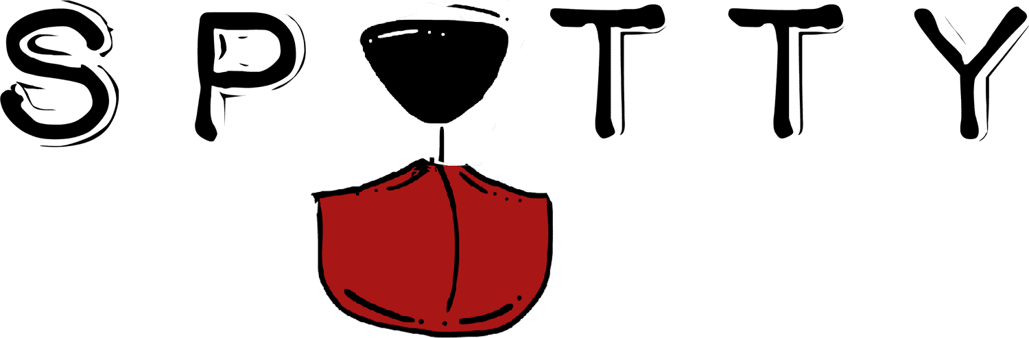
- Our team has decided to change the name of the product from ‘Wire Loop Game’ to ‘Spotty’ because we implemented the ‘dog/bone analogy’.
Improvements Drawn from Formative Feedback
- Instruction/tutorial animation has been improved to give more precise information of how to play the game. During the computer prototype usability testing, the users only partially understood how the game worked. Thus, our team modified the tutorial animation to be more specific and detailed.
- We renamed the ‘Previous Score’ to ‘Highest Score’ in the ‘Level Clear’ page. Displaying highest score is more relevant for users that it gives a goal and motivates the users to achieve the highest score for each level.
- We did not completely removed the ‘Quit’ label, but we changed it to ‘Click home button to quit’ and set the tablet device setting to display game in only one orientation to prevent the label from pointing wrong side of the device. Our team was reluctant to delete this label because the user during the paper prototype usability testing had no idea how to quit from the application because she had no any experience in using tablet device.
- Continued from automatic page transition implementation above, our team set the delay time between transition and user’s success/failure to 1 second. During the development, we felt that no delay before the transition was too quick, but also more than 1 second of delay gave enough time to move the dog around.
- Our team implemented the feature that sets the background of the game screen to red if score is deducted and a -5/-10 label is shown beside the score. Group 2 commented that the change in score is not noticeable enough and the users were not easily aware of the decrease in score.
- The given game time is changed from 10 seconds to 5 seconds because the users felt the game was easy. We hope that decreasing the given time increases the difficulty of the game and that the game motivates the users more than it did with the previous time settings.
User Manual
The manual has been updated from the initial version to now include more intermediate steps, additional screenshots, thorough explanation of the scoring system and menu navigation in the new manual.
Summary of Contributions
|
Mohamed |
Radhika |
Chan Woo |
| Development |
- |
- |
8 |
| Feedback Overview |
- |
- |
1.5 |
| Test Result Comparison |
|
0.5 |
1 |
| Prototype Improvement |
- |
0.5 |
2.5 |
| User Manual |
1 |
4 |
0.5 |
| Web Notebook |
3.5 |
- |
- |
| Total |
4.5 |
5 |
13.5 |